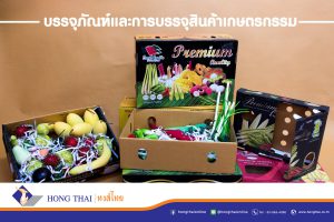
In packaging design—whether for food and beverage containers, paper boxes, or corrugated cardboard boxes—colors and patterns help enhance product visibility and consumer recognition. Additionally, selecting the right images for packaging design can convey meaning and make a product more appealing.
Principles of Image Selection in Packaging Design
When designing packaging, especially for corrugated cardboard boxes that allow for printed patterns or images, selecting the right visuals is essential for aesthetics and conveying product information. The key principles for choosing images include:
- Select images that align with the product and target audience.
- Ensure the image style is consistent with the media format and the primary objective of the presentation.
- Use high-contrast images for clarity and visibility.
- Studies suggest that larger images attract more attention. Image proportions, such as width and height ratios, can be adjusted to create visual impact.
- Consider using distinctive images or a collage of smaller images to form a larger, more engaging visual.
Types of Images and Their Communication on Packaging
When selecting images for packaging, designers classify them based on their method of representation, which falls into three categories:
- Realistic Representation: Images that closely resemble real objects, emphasizing accurate shape, form, and color. Examples include photographs or highly detailed illustrations.
- Stylized Representation: Images that simplify or modify real objects while retaining recognizable features. This includes cartoon illustrations commonly used on food packaging for children.
- Symbolic Representation: Images that do not depict reality directly but convey emotions or associations related to the product, using abstract or symbolic elements.
Emotional Impact of Images on Packaging
Images on food packaging, corrugated boxes, or general paper packaging can evoke three types of emotional responses:
- Positive and calming: Such as landscapes, waterfalls, streams, or flowers.
- Negative and unsettling: Such as images of monsters, wild animals, or accidents.
- Neutral with no strong emotional impact.
Studies indicate that unsettling images may capture initial attention more effectively but lose engagement quickly, whereas calming images maintain longer-lasting appeal. Understanding the principles of image selection and packaging design is valuable for businesses and designers in making strategic visual choices.